Lower Grafton Council for Young Children and Families
THE ASK:
Design a logo and digital identity for LGCYCF that will build recognition for the non-profit. The branding would need to resonate with two distinct audiences. First, families and home childcare providers; and second, professional childcare providers and organizations. LGCYCF offers resources and support for both audiences to promote positive social and emotion development in young children aged 0-5.
THE ANSWER:
With those target audiences in mind, CG Studios created a logo that took the form of a seal with light-hearted characteristics. Color is essential to the brand; yellow and light blue convey fun and optimism. Navy blue signifies strength and stability. Similarly, the font families — Raleway and Times New Roman — create a friendly yet authoritative vibe.
Logo and Branding
The golden seal is unwavering as the most iconic part of the LGCYCF brand. The typography and color palette further support the dual audience appeal of the non-profit.


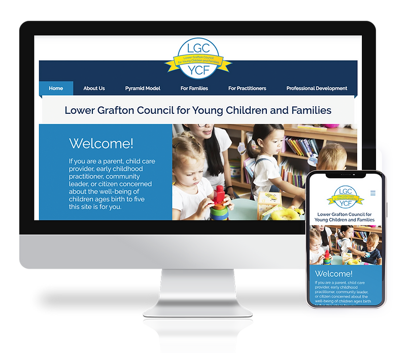
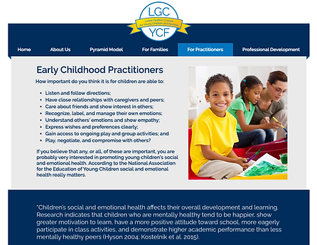
Digital Identity — Website and Social Media
Built to serve both of LGCYCF audiences, the website is easily navigated, allowing the end-user to quickly locate information. Rich content — provided by the LGCYCF team — makes the website a full and robust resource. Social media has been designed to spark conversation, explain services, highlight partners, and bridge new professional connections. View the full website at www.lgcycf.org.
Website

Social Media


Other Case Studies

